Researchers at MIT Media Lab are using crowdsourced data to create an algorithm that determines how safe a street looks to the human eye – information that could be used to guide important urban design decisions.
In 2011, researchers at the MIT Media Lab debuted Place Pulse, a website that served as a kind of “hot or not” for cities. Given two Google Street View images culled from a select few cities including New York City and Boston, the site asked users to click on the one that seemed safer, more affluent, or more unique. The result was an empirical way to measure urban aesthetics.
Now, that data is being used to predict what parts of cities feel the safest. StreetScore, a collaboration between the MIT Media Lab’s Macro Connections and Camera Culture groups, uses an algorithm to create a super high-resolution map of urban perceptions. The algorithmically generated data could one day be used to research the connection between urban perception and crime, as well as informing urban design decisions.
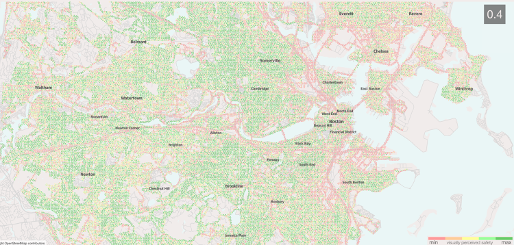
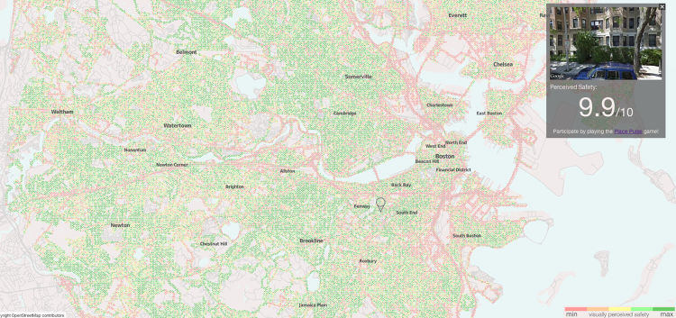
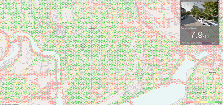
The algorithm, created by Nikhil Naik, a Ph.D. student in the Camera Culture lab, breaks an image down into its composite features—such as building texture, colours, and shapes. Based on how Place Pulse volunteers rated similar features, the algorithm assigns the streetscape a perceived safety score between 1 and 10. These scores are visualised as geographic points on a map, designed by MIT rising sophomore Jade Philipoom. Each image available from Google Maps in the two cities are represented by a colored dot: red for the locations that the algorithm tags as unsafe, and dark green for those that appear safest. The site, now limited to New York and Boston, will be expanded to feature Chicago and Detroit later, and eventually, with data collected from a new version of Place Pulse, will feature dozens of cities around the world.
From our partners:
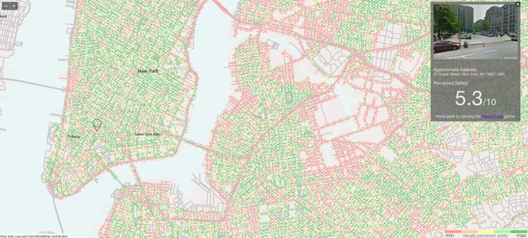
The hope is to “identify features of urban planning which contribute to the appearance of safety or unsafety,” according to Naik, who studies computer vision and machine learning. “How can you introduce elements that can make the city look safe?” More trees, for example, tend to make a neighborhood look safer. Brick buildings, Naik says, tend to score lower than newer buildings that feature wood paneling.
Looking at the maps, what becomes immediately apparent is the ugliness of infrastructure. Most neighborhoods—even in the most expensive sections of Manhattan—exhibit a multi-coloured mishmash of green, orange, and red. Yet infrastructure often stands out as a deep gash of uniform red bounding otherwise fairly green neighborhoods. Bridges and highways become easily identifiable because stretches of open, bare pavement get low safety scores. So, too, do industrial waterfronts and clusters of warehouses and parking lots, which form pockets of all-red in Brooklyn. “In New York City, you find this division between two places that are physically close, but you have a perceptual gap—you have a place that is uncomfortable to be,” according to StreetScore principal investigator César Hidalgo. “These are the places we can start looking at intervening,” he emphasises, by looking at what design elements make those places look unsafe.
[infobox]How can you introduce elements that can make the city look safe?[/infobox]In some cases, however, the algorithm can be an uncertain judge of a city’s character. Its rules are based on evaluations of only a few thousand images from two Northeastern cities, so it’s not yet very good at predicting how safe cities with different architectural styles feel. A safe-looking neighborhood in tree-lined, brownstone Brooklyn has very different visual characteristics than an equally safe-looking neighborhood in a desert city like Tucson, which is why Place Pulse is now collecting data on 56 cities across the world. Even in New York and Boston, the prediction algorithm has its limitations: One image tagged with a bright red dot on New York’s tony Upper East Side turns out to be a Street View image from inside the elegant Frick Collection mansion—arguably not a very dangerous-looking place.
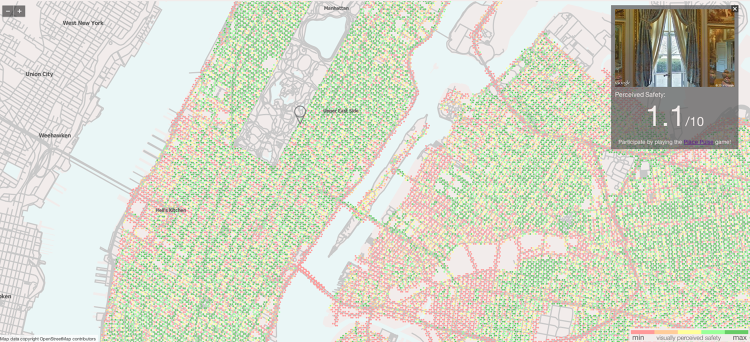
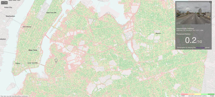
Yet the sheer volume of the data provided by StreetScore makes it valuable for (at least preliminary) research on crime and urban design. The causes of crime are complex, and the connection between how safe an area appears and how safe it actually isn’t cut-and-dry, of course. The broken windows theory, which contends that reigning in aesthetic disorder like graffiti, litter and broken windows can bring down rates of more serious crimes, has been criticised by many scholars. But previous research on New York City has found a significant correlation between perceived safety and homicide rates.
[infobox]With crowdsourcing and machine learning, researchers can start to create much larger data sets on how people perceive neighborhoods.[/infobox]With crowdsourcing and machine learning, however, researchers can start to create much larger data sets on how people perceive neighborhoods, and those data sets may be easier to cull than traditional surveying. The hope is that it will add depth to our research on the links between the visual perception of a neighborhood and crime.
Check out StreetScore here.
This article originally appeared in Fast Company.
–>
