New Yorkers and San Franciscans pay a lot more for apartments, groceries and other expenses, but they also expect to make much higher salaries. Meanwhile, workers in Pittsburgh, Des Moines and Boise justify their lower salaries by the cheaper cost of living in their cities.
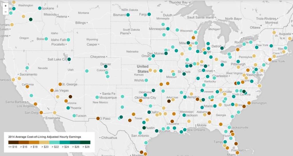
This principle is true around the US, but it turns out that there are some variations in how far a paycheck really goes, as the map below by Governing.com shows. Cities marked with a brown circle have lower earnings relative to the cost of living and thus are relatively expensive to live in. Those with green circles are on the opposite end of the spectrum, meaning their residents’ paychecks will go farther.
The map shows average hourly earnings for private sector workers in cities around the US in 2014, according to the Labor Department, adjusted by the average cost of living. The cost of living is based on an index published by the Council for Community and Economic Research for the third quarter of 2014, which considers expenses for housing, groceries, health care, transportation, utilities and other goods and services.
The adjusted wages vary from a low of $14.31 per hour in Flagstaff, Arizona to $29.92 per hour in Durham-Chapel Hill, North Carolina. Some of the biggest US cities, including New York, Miami, San Francisco, San Diego and Los Angeles turn out to be relatively expensive for workers, as are small cities like Myrtle Beach, S.C.; Hot Springs, Ark.; and Flagstaff, Ariz.
From our partners:
Other cities come out relatively well by this measure, due to higher wages, a cheaper cost of living, or both. Those cities include Houston, Austin, New Orleans, Tampa, Washington, Baltimore, Philadelphia, Detroit, Chicago, Denver and Phoenix.
One shortcoming of this methodology is that the adjustment doesn’t reflect the varying cost of living within metro areas – obviously the cost of living can differ a lot from one neighborhood to another. In addition, the coverage areas used by the Council for Community and Economic Research don’t correspond exactly with the metro area boundaries used by the Labor Department. Still, the map provides a fascinating insight into how far wages generally go in cities across the US.
For an interactive version of the map that shows you hourly earnings and cost-of-living-adjusted wages for each city, you can visit Governing.com’s site here.
This feature originally appeared in Washington Post.


