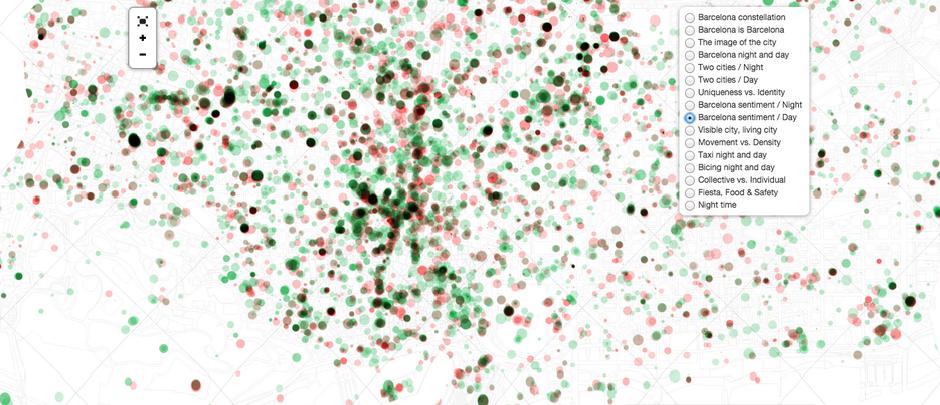
At night in Barcelona, Gaudi’s Parc Guell lights up, and the little restaurants in Las Ramblas hop with energy. People move around, catch cabs, tweet thoughts, take pictures, laugh with friends. Aside from the laughter, these other evening activities can leave a data trace that researcher Mar Santamaria Varas, architect Pablo Martínez Díez, and engineer Jordi Bari Corberó have used to create 16 beautiful maps of the city.
The trio’s atNight project offers a fresh presentation of social media activity and open data collected across Barcelona after dark. They hope the project leads to insights about when, where, and how city folks interact with their environment—and perhaps even helps urban planners design the city more intuitively. But the images can be enjoyed in their own right, too. Let’s take a look.
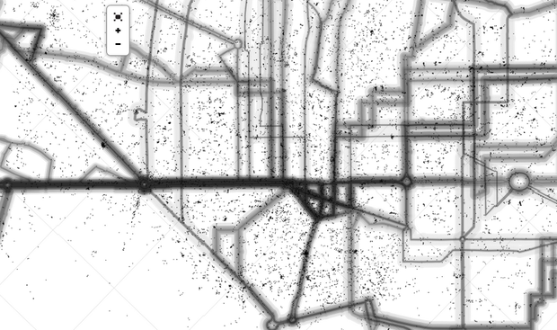
This first map superimposes locations of personal tweets (the little spots) onto nighttime routes of Barcelona buses (the fuzzy lines) to examine the contrast between collective and individual behavior. It demonstrates how individual activity is sprinkled around the arteries and veins of the city.
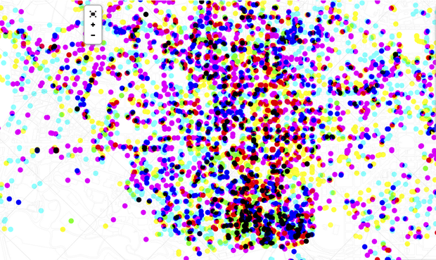
This next map is inspired by this “tree, cab and crime” map of San Francisco. The creators use Google Places to pinpoint “safe” places to let loose when the sun goes down. (Note: They define “safe” as spaces under surveillance.) Cyan dots represent parties, magenta ones are food joints, and yellow ones are where the cameras are.
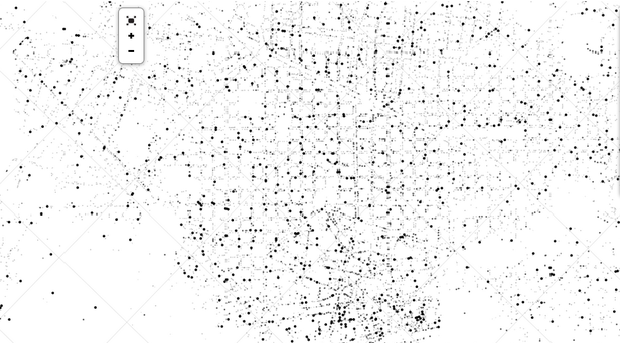
Each dot on the next map represents a business—restaurants, offices, pubs, bookstores, etc. The size of the point depends on the opening time; the bigger the dot, the later the place opens.
From our partners:
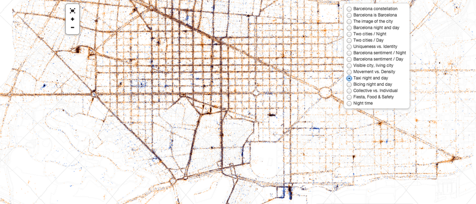
In the next few maps, the atNight team used transportation data to look at how people experience the city at different speeds and by different means of movement. The first shows the concentration of bikes in Barcelona’s bike-share docks during day (orange dots) and night (blue); the second visualises Barcelona’s taxi fleet activity; and the third illustrates how people move in public and private spaces by layering density data with taxi routes.


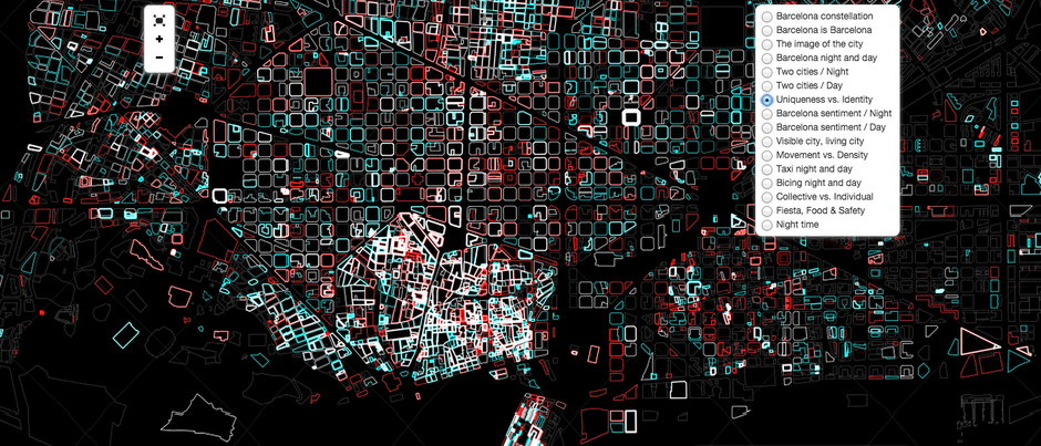
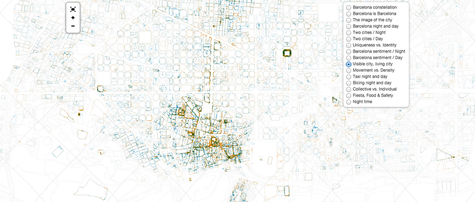
This next map may be the weirdest of the group, visually speaking. It represents social media activity by block. Daytime activity is in red and nighttime in blue. When there is activity at both times, the outline is in white, explains Díez. The width of each block varies to represents the volume of social interactions. So we can see that certain areas and buildings are more active on social media than others, and some people just go around the clock.
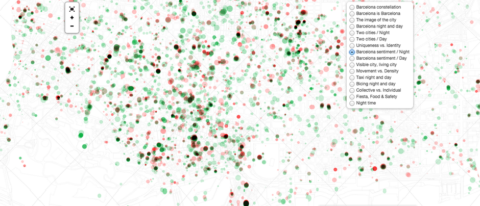
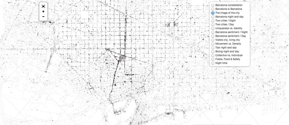
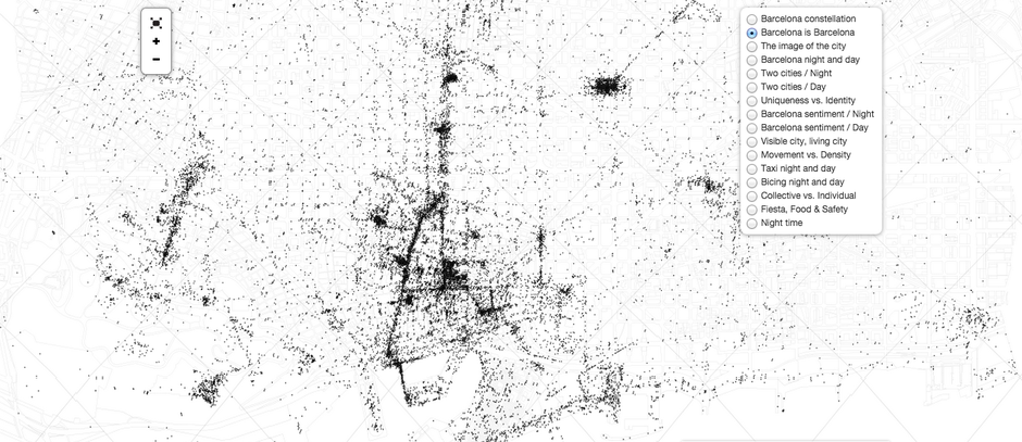
The rest of the maps rely heavily on how social media expressions shape the city: how people’s tweets relate to the city’s geography, what the language in their messages says about them, and how the photos they post represent the city.



Explore the data behind the maps here.
This article originally appeared in CityLab.
