Street signs, airport signs, signs in shopping malls and railway stations: they’re all around us, but we only really notice them when they go wrong – when we’re looking for a sign that’s not there, or are led in a circle by a mysterious set of signs whose promised objective never appears, as though we are the butt of some deadpan semiotic joke cooked up in the bowels of the University of Paris. Yet signs are, of course, carefully designed objects. They have a history and, right now, are even in the throes of something like a revolution.
The Legible Cities movement takes its inspiration from the American social geographer Kevin A Lynch, who published the seminal book The Image of the City in 1960, introducing the concept of the “legibility” of urban space. The modern Legible Cities idea began in Bristol in the late 1990s, when planners wanted to communicate information about city-centre regeneration projects. It became a graphically consistent network of new directional signs, street information panels with maps, printed maps, and plaques. Taken together, this all constitutes a “wayfinding system” (another Lynchian coinage).
The project was conceived by Bristol town planner Mike Rawlinson, who now has his own company, City ID, to extend the practice to other places around the world. “It was about stitching together the city,” he explains of the Bristol project. “The crucial thing is to build any sign system as a system: it’s a network, and you have to plan the routes. You do a lot of modelling – there is a science to this. You have to model new buildings or places through scenarios, data, flow data, trying to predict the needs of the user at any point in their journey. If you get that right, job done. People don’t complain, they just get on and move.”
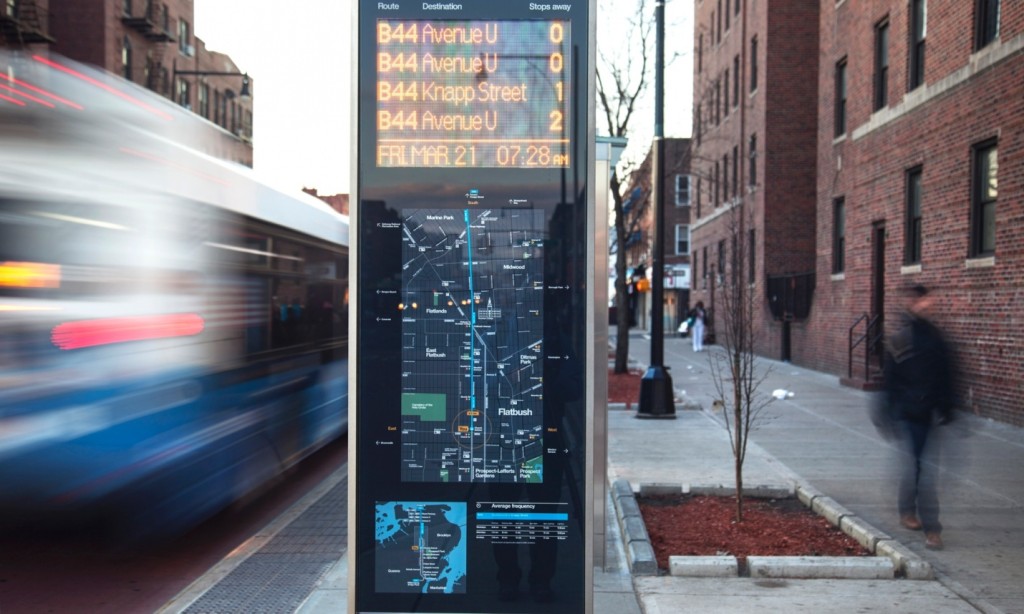
The Bristol experience inspired, in turn, the project Legible London, which was spearheaded by Patricia Brown, then CEO of Central London Partnership and now running the urban consultancy Central. The most visible results of Legible London today are the public-information boards with local maps on them. The big ones, pleasingly, are called “monoliths” (no Kubrickian evocation of hooting apes is presumably intended), and there are also midiliths and miniliths. “My personal image [for the project],” Brown says, “was for London to put a subliminal arm around people.”
Brown takes a slightly apologetic pleasure in explaining some nice terms of wayfinding jargon. Designers talk a lot about “mental maps” and “space syntax”. Signs must dole out information as needed: this is “progressive disclosure”. A “desire line”, meanwhile, is where people actually want to go. So in a park, a desire line is visible in worn-down grass, where people walk instead of using the path. (“Some people design parks without paths to begin with,” she explains, and then build the paths along the emergent desire lines.)
From our partners:
Signs in general, as semioticians since CS Peirce and Saussure have pointed out, depend on often arbitrary conventions for their interpretation. Why, for example, does the “up” direction on the vertically oriented roadside sign mean “forwards” to the driver? Imagine the confusion that would arise if we had cars that could fly upwards as well as tool around on the surface.

Thus, as the philosopher Ludwig Wittgenstein observed, one needs training in the conventions governing any sign. Even the fact that it is the “finger” of a signpost that points in the right direction, and not the other end of it, is something that you have to learn. This is one reason why a good wayfinding system must be a semantically consistent whole. Signs, Brown explains, should always appear “in the right place and the right way, so you trust the system”.
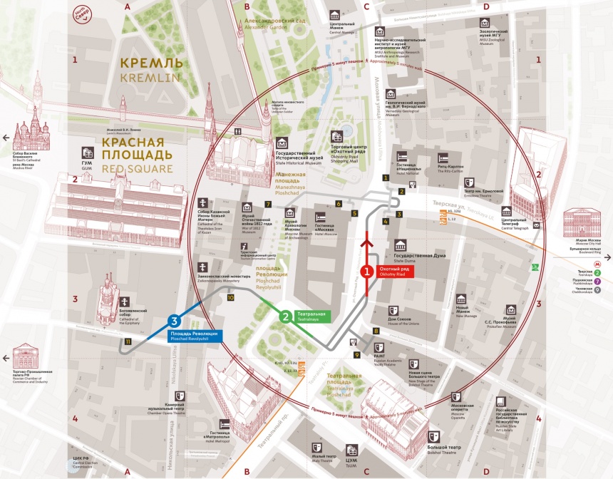
Rawlinson is currently working on a project for Moscow’s transit system, which includes a new design for the Cyrillic alphabet. “We’ve commissioned specialist typographers A2 Type, who are collaborating with Ilya Ruderman, a Moscow-based typographer, on the Cyrillic scripts,” he explains. “Things like typography are as important as a building, they’re used millions of times – so why not think of it as part of the DNA of the city itself?”
Moscow’s vision, he explains, is “to build a world-class legible transportation network” within two to three years, starting with its metro. “It is the second most heavily used transit system in the world, with 9 million Muscovites using the metro – the equivalent to the population of Sweden – every day.” The system is planned later to extend to bike-share, bus and tram systems. More than 50 specialists are involved in the project, “across everything from information and product design, cartography and specialist illustration to engineering and project-management services”.
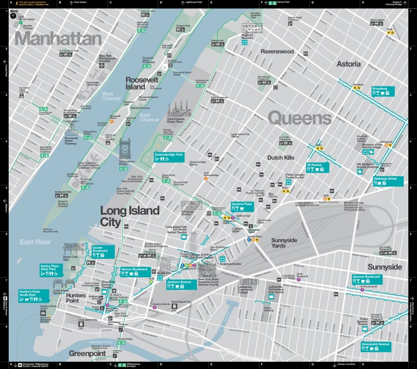
Rawlinson has also worked on new wayfinding in New York, where font choice was again important (“we worked with Monotype to adjust Helvetica”). It turns out, Rawlinson explains, that at any one moment in New York City, “quite a high proportion of people are lost.” This might seem strange given the predictable rectilinear layout of most of Manhattan, but so the statistics showed. “The commissioner for transport built the business case on the percentage of time people were getting lost.”
In New York, a new sign system also presented an opportunity to encourage visitors to strike out in new directions. “They were getting clusters of people doing the tick-list thing in the guidebooks,” Rawlinson says.
“What they wanted to do was to get people to engage more in the life of the city rather than the top 10 attractions.” If you get the signs right, he says, you “spread the footfall and therefore spread the spend”.
It would be too cynical to interpret these projects as ruled merely by a vision of people as ambulatory wallets, prey to nudging by clever signs in the direction of interested businesses. But there are questions to be asked about who gets to write the legible city, points out Leo Hollis, urban theorist and author of Cities Are Good For You.

“In general, I am pro the legible city [movement],” Hollis says, “as it does what it says on the tin. But there are serious problems in the decision-making behind the signs. Like all urban technologies, one has to be very cautious about who is running this, and who it is aimed at. If the legible city only maps shopping malls, car parks and the police station, this seriously reduces what the city has to offer. This can make parts of the city invisible to the visitor. Someone somewhere has made an arbitrary decision that tourists don’t want to go there, or that place is too dangerous so it should be avoided.
“There are some interesting thought experiments,” Hollis argues, “that could enact a response. What if the community decides what to put on the maps rather than the council planning department? The alternative is to think that every part of the city is worth visiting and that the whole city should be open and legible, not just privileging certain sectors.”
After patiently listening to all this, a smartphone user might ask: well, who needs physical wayfinding systems any more, when we have technology? Recently, I tried the experiment of getting Google’s pedestrian directions pumped into my earphones (the mellifluous recorded woman’s voice interrupting Queens of the Stone Age’s mellifluous racket just before each intersection) in order to get me from a London Overground station to an unfamiliar pub 15 minutes’ walk away. I got there with no problems, in something of a pleasant daze. As Google is, increasingly, mapping the interiors of public buildings as well (museums, malls), it might soon be possible to go everywhere this way.
But would we want to? There’s no way I would find my way to that pub again without help. And I had taken no notice at all of my surroundings. It was as though I had passed frictionlessly through an opaque sonic tunnel. Get too used to this, and you’re lost without a mobile data signal, even if you don’t mind the psychic disconnection from the scenery that moving this way encourages. Perhaps, then, the older technology of physical signage still has a place. With a gadget, argues Brown: “You actually outsource the solution, you don’t own the solution.”
At the same time, if we resist relying wholly on the digital prosthetics of smartphone mapping, we might also want to resist relying wholly on the physical prosthetics of official signage as well. Even in the most legible city, Rawlinson says, it should still be possible to be a be a “flâneur, getting lost, dériving or deriving your city experience”. For Legible London, Brown adds, the mantra was “the confidence to get lost”. In the age of the techological optimisation of the urban machine, the drive towards a “smart city”, Hollis wonders: “Are we losing the romantic power of getting lost in the city? Isn’t it nice sometimes to lose oneself, and time, in places we have never been before?”
The alternative is a city that is so legible that, paradoxically, it becomes unknowable. That is a kind we have already been warned about — by Marco Polo in Italo Calvino’s deathless novel Invisible Cities. Back from the sign-forested city of Tamara, he explains to Kublai Khan: “Your gaze scans the streets as if they were written pages: the city says everything you must think, makes you repeat her discourse, and while you believe you are visiting Tamara, you are only recording the names with which she defines herself and all her parts.
“However the city may really be, beneath this thick coating of signs, whatever it may contain or conceal, you leave Tamara without having discovered it.”
This feature is adopted from The Guardian.


