Le Corbusier’s plan may not have had such power if he hadn’t put it on paper. The French modernist architect wanted to reform the polluted industrial city by building “towers in a park” where workers might live high above the streets, surrounded by green space and far from their factories. His idea was radical for the 1930s, and it was his diagrams of it that really captured the imagination.
“It swept everyone along,” says Benjamin Grant, the public realm and urban design program manager for the San Francisco Planning and Urban Research Association. “They were such compelling drawings of such a compelling idea.”
[infobox]In the urban context, diagrams can be powerful precisely because they make weighty questions of land use and design digestible in a single sweep of the eye.[/infobox]Le Corbusier’s iconic plan for his “Ville Radieuse” was an obvious choice when Grant and SPUR began to curate the exhibition, “Grand Reductions: Ten diagrams that changed urban planning.” Le Corbusier’s tidy scheme for “towers in a park,” drawn as if on a blank slate, would influence planners for decades to come. Some of the other diagrams in this survey are a bit more surprising.
The exhibition’s title – Grand Reductions – suggests the simple illustration’s power to encapsulate complex ideas. And for that reason the medium has always been suited to the city, an intricate organism that has been re-imagined (with satellite towns! in rural grids! in megaregions!) by generations of architects, planners and idealists. In the urban context, diagrams can be powerful precisely because they make weighty questions of land use and design digestible in a single sweep of the eye. But as Le Corbusier’s plan illustrates, they can also seductively oversimplify the problems of cities. These 10 diagrams have been tremendously influential – not always for the good.
From our partners:
“The diagram can cut both ways: It can either be a distillation in the best sense of really taking a very complex set of issues and providing us with a very elegant communication of the solution,” Grant says. “Or it can artificially simplify something that actually needs to be complex.”
Over the years, some of these drawings have perhaps been taken too literally, while others likely lie behind some of your favourite spots in your city. “Even if you don’t know the diagram,” Grant says, “you might know the places that the diagram inspired.”
1. Ebenezer Howard’s Garden City
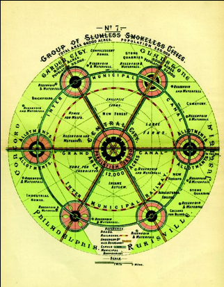
This diagram was published in Howard’s 1903 treatise “Garden Cities of To-Morrow.” Howard wanted to design an alternative to the overcrowded and polluted industrial cities of the turn of the century, and his solution centred on creating smaller “garden cities” (with 32,000 people each) in the country linked by canals and transit and set in a permanent greenbelt. His scheme included vast open space, with the aim of giving urban slum-dwellers the best of both city and country living. He captioned the above diagram “A Group of smokeless, Slumless Cities.”
2. Le Corbusier’s Radiant City
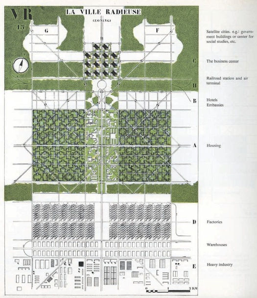
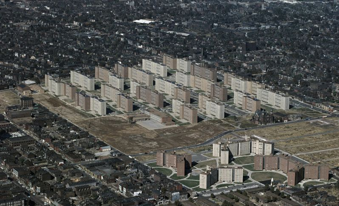
Le Corbusier was trying to find a fix for the same problems of urban pollution and overcrowding, but unlike Howard, he envisioned building up, not out. His plan, also known as “Towers in the Park,” proposed exactly that: numerous high-rise buildings each surrounded by green space. Each building was set on what planners today would derisively refer to as “superblocks,” and space was clearly delineated between different uses (in the above diagram, this includes “housing,” the “business centre,” “factories” and “warehouses”). Le Corbusier’s ideas later reappeared in the design of massive public housing projects in the U.S. in the era of “urban renewal.” This is an image of the famous Pruitt-Igoe housing project in St. Louis that was demolished just 18 years after it was built.
3. Frank Lloyd Wright’s Broadacre City

America’s 1785 Land Ordinance divided most of the country’s unsettled interior west of the Ohio River into a neat grid of townships 6 square miles in size (each containing 36 square-mile parcels of land for the kind of agrarian, land-owning society Thomas Jefferson envisioned). If you drive across – or fly over – the Midwest today, its effects still linger in all those perfectly perpendicular roads and square farms. Frank Lloyd Wright took the geometry of this rural grid even further in his vision for a utopia with each family living on an acre of its own. That level of density would have essentially spread suburbia over the entire country.
4. The Street Grid

The simple, rational street grid has been a default choice of planners for centuries (one that was widely discarded in the U.S. in the 1950s as we moved into suburbs and cul-de-sacs). The 1811 Commissioner’s Plan for Manhattan tried to establish a strict street grid for the development of the rest of the island. Several decades later, this 1852 map of San Francisco did the same, conveniently ignoring the city’s irregularly shaped coastline and topography.
5. The Megaregion
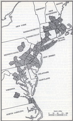
Planners increasingly talk today about issues involving transportation, the economy and the environment not at the scale of communities or cities, but within whole regions where multiple metros link together. The “megaregion” concept isn’t new, though. This 1961 map from Jean Gottman’s book Megalopolis illustrates one continuous Northeastern megaregion from Washington, D.C., to Boston.
6. The Transect
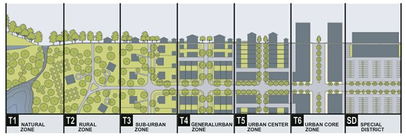
Transects have been used by planners as a visual tool to divide landscapes into multiple uses. This particular one, created by architect Andres Duany, illustrates the rural-to-urban gradation between nature and dense urban zones and has become a popular framework among New Urbanists.
7. The Setback Principle

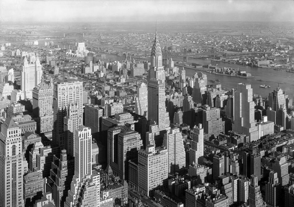
As cities came to fill with skyscrapers in the early 20th century, planners turned their interest from the layout and footprint of neighbourhoods at street level to the volume of buildings as they rose toward the sky. New zoning laws in New York City in 1916 (from which the above diagram comes) required buildings to grow narrower the taller they got, so that daylight would still reach the streets below. This photo illustrates how the city’s skyline evolved as a result:
8. The Nolli Map

This 1748 map of Rome was created by Giambattista Nolli. It doesn’t look particularly exceptional today, but Nolli’s map established the now common practice of portraying entire cities from above without a single focal point (every block is viewed instead as if the cartographer were directly above it). The resulting image highlights the shape of the city’s street network and its development patterns.
9. Psychogeography
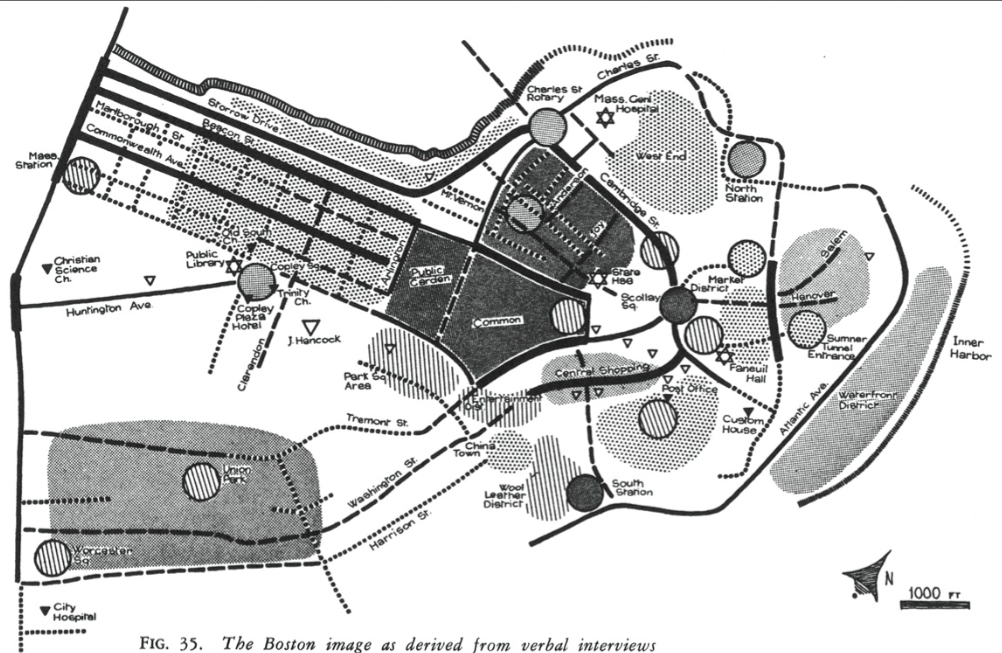
“Situationist” artists and architects from the 1950s sought to capture the city as it was experienced by actual people, not as it was designed from the top down by architects and planners (at the time, they were revolting against modernist urban renewal plans). Their approach helped give way to a new emphasis in planning on bottom-up citizen experience and input. The above 1961 map from MIT’s Kevin Lynch resulted from a project asking people to map the city of Boston from memory, revealing essentially the most “memorable” parts of the city. Maps today built from FourSquare checkins, Twitter traffic or bikeshare usage stem from this same tradition.
10. The Hockey Stick

You have likely seen this diagram in many other contexts having little to do with urban planning. This famous image from climate scientist Michael Mann illustrates the spike in temperatures in the Northern Hemisphere since the beginning of the Industrial Revolution. SPUR ends its exhibition with this diagram to draw attention to the link between “smart growth” and climate change. “That has become really the organizing narrative of planning in the 21st Century,” Grant says. “The idea that there’s a connection between the shape of cities and the patterns of settlement and their climate impact is so powerful. So many other ideas can be sort of subsumed within that narrative.”
All images are from San Francisco Urban Planning Research Association.
This feature was written by Emily Badger and originally appeared in CityLab.


