David Leonhardt of the Upshot summarised a work from economist Stephen J. Rose as follows: “Income inequality has not actually risen since the financial crisis began.” That finding runs counter to conventional wisdom that the rich have gotten richer while the poor have gotten poorer (or, at least, no richer) in recent years. It also stands in contrast to other high-profile research that’s reached the opposite conclusion.
Turns out there’s a fine explanation for the discrepancy: Rose says looking at the years 2007 to 2009, in addition to bounce-back years of 2009 to 2012, presents a more complete picture. But income inequality, however you measure it, is only part of the story. Last February 2015, the Urban Institute released an interactive data tool that presents an arguably bigger picture by laying out how wealth inequality in America has increased over the last 50 years—especially along racial and ethnic lines.
Wealth measures the assets of a family—their savings, real estate, businesses—and subtracts their debt. It’s arguably more important than individual income because wealth gets passed on from one generation to the next, determining a person’s starting line. It’s also an often overlooked indicator, says Signe-Mary McKernan, one of the economists behind the new tool.
“Wealth is so important as a springboard to the middle class,” she says. “It’s where economic opportunity lies.”
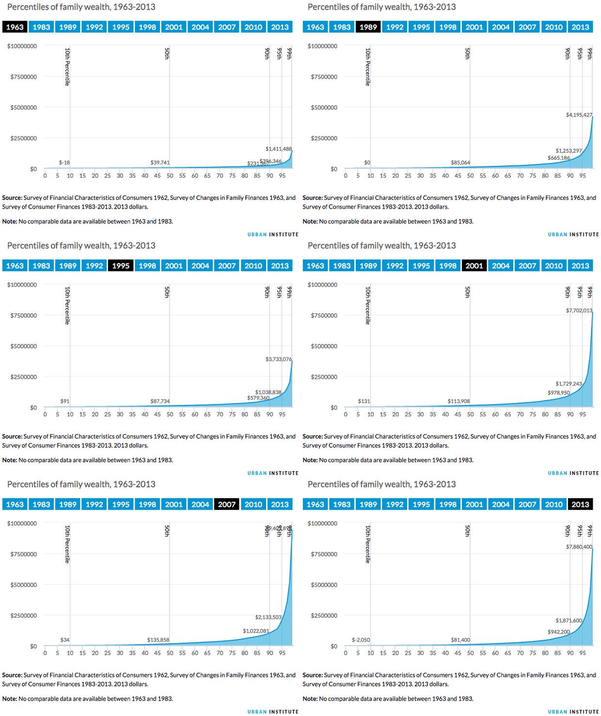
The Urban Institute’s wealth inequality charts take into account earnings gaps, homeownership rates, retirement savings, student loan debt, and yes, income inequality. They find that, in 1963, families near the top of the wealth spectrum had 6 times the wealth of those in the middle, whereas in 2013, the top families had 12 times the wealth of the middle. Watch the gap grow over time in the animated chart below:
From our partners:
The Urban Institute did look at income inequality as a factor affecting wealth. The chart below shows a 70 percent increase in income from 1963 to 2013 for families at the top of the totem pole (though the top tier’s income did plateau in the post-recession years). The income of families at the bottom stayed roughly the same over that same 50-year period:

The Urban Institute tool also demonstrates how the wealth gap is much wider for families of color. In 2013, for instance, white families had seven times the wealth of African American families and six times the wealth of Hispanic families:

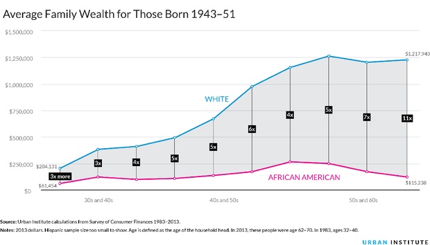
The racial wealth gap also seems to grow as people age. Among people in their thirties, whites have three times as much wealth as African Americans, but once both groups reach their sixties, whites have 11 times the wealth (below, top). The average white person also accumulates $2 million in wealth over a lifetime, versus $1.5 million for a typical African American and $1 million for a typical Hispanic (below, bottom):

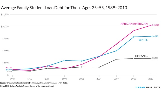
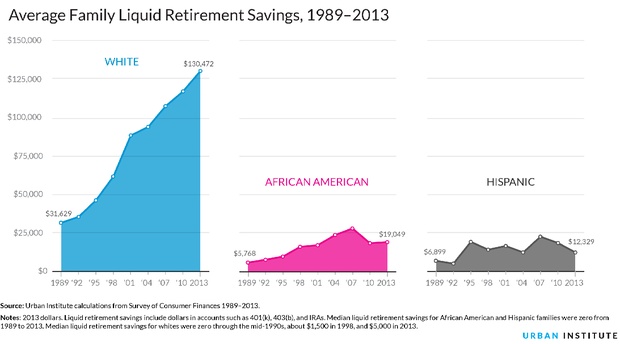
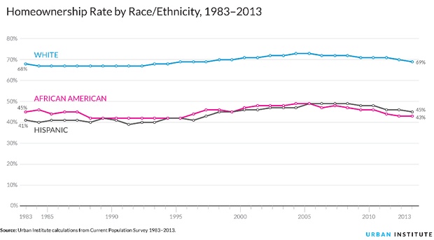
The wealth gap is generational, too. The Urban Institute reports that white families are “five times more likely than African American families to receive large gifts or inheritances.” The next three charts show the racial gap in terms of student loan debt, retirement savings, and home-ownership—all factors that contribute to wealth over a lifetime, and flow from one generation to the next:
To reduce wealth and racial disparities, the Urban Institute recommends adjusting current policies, such as federal asset-building subsidies, to better serve low-income families. Despite his different approach, Rose would agree that government policies can make a difference. In his paper he argues that one of the reasons the income gap decreased after the recession is because the Obama administration’s safety net policies softened the blow for the middle class. Leonhardt embraces that point in the New York Times:
“Inequality isn’t destined to rise. Not only can economic forces, like a recession, reduce it, but government policy can, too. And Washington’s recent efforts to fight inequality–as imperfect and restrained as they’ve been–have made a bigger difference than many people realise.”
That’s true enough. But as the wealth inequality data show, there’s obviously more to the picture—and more to do to close the gap.
This feature is adapted from CityLab.


