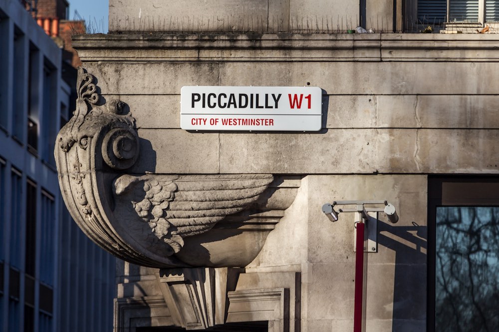
Most city dwellers speed-walk along crowded streets each day, barely taking notice of the typography that adorns everything from storefronts and street signs to museums and office buildings.
“A good typeface creates an emotional response in relation to the message it is conveying.”
But even if you can’t identify a serif from a sans serif, you know you’re in a New York City subway station when you see the iconic, tightly spaced Helvetica letters, just as the classic Johnston Sans font—designed for London’s public transport in 1913—is synonymous with the Underground.
More than just a lettering style, the typeface of logos and signage is as much a part of a brand’s identity as its products and services—whether that brand is a city, a retail space or a cultural center.
Typography creates a sense of place, invoking history, reflecting changing lifestyles and trends, and setting an expectation before one enters a space.
From our partners:
“A good typeface creates an emotional response in relation to the message it is conveying,” Jonathan Barnbrook, founder of the website Virus Fonts, told theBBC. “You’re trying to get that tone of voice right—you can shout or whisper. And you want to sum up the spirit of the age, because they do date quite quickly.”

SAY IT WITH TYPEFACE
Whether letters are rounded or straight, lowercase or capitalized, connected or spaced, typography can speak volumes about what kind of institution you’re entering and the feeling it’s trying to communicate.
“If you’re opening an office building or a condo complex and targeting a particular age group, maybe you’d go for a super modern, techy typeface that’s all lowercase and that would resonate with some people as being young and entrepreneurial,” says Amanda Bowers, creative director at design firm PS212, who has worked extensively with typeface design for logos and signage.
“Or maybe you’re a financial institution and you want to look more buttoned-up and stable, or corporate? These are things that typography can achieve.”
When it’s designed well, typeface has the ability to transcend language.
“When you encounter a language you don’t read, your eyes are then looking at the letterforms individually to find points of reference,” says Bowers.
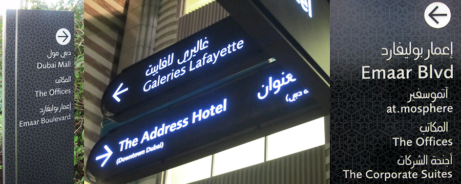
“I don’t read Arabic, for example, but you study the form itself—how bold something is, how it relates to other things on the page, the colors. All of that can bring meaning and another layer of reading that you’re not even conscious of,” she says.

IN DUBAI, CALLIGRAPHY-INSPIRED MODERN TYPE
Australia’s Emerystudio, the firm designing the wayfinding systems for the Burj Khalifa in Dubai, wanted to use Arabic typography that would be “distinctive, legible and harmonious when placed next to Latin lettering,” according to The Atlantic.
Dr. Mamoun Sakkal, a Syrian-born, U.S. type designer transformed Shilia, a Latin-complementary typeface he created in 1978 into a more modern, calligraphy-inspired type family called Burj Khalifa Shilia.
The font is now increasingly in demand around—and beyond—Dubai.
While the typeface has won praise for its artistic design, for Sakkal, usability trumps beauty, particularly when it comes to city signage.
“Although I am a firm believer in the need for artistic innovation, I think that in type design intended for general use, this should be balanced with the needs for legibility and unobtrusive originality, both of which are intimately related to historical precedence and collective experience with the written language over many centuries,” Sakkal told The Atlantic.
HELVETICA: CLEAN AND SIMPLE
“The Helvetica used in subway systems … [is] so specific to New York, even if Helvetica itself isn’t necessarily.”
Perhaps no font is as ubiquitous as Helvetica, the Swiss font whose cult following was celebrated in Gary Hustwit’s 2007 documentary of the same name.
Hustwit’s film examines how the font took over cities across the world, perhaps none as apparent as New York, where it can be found on subway platforms, mailboxes and retail stores, such as Bloomingdale’s.
“The Helvetica that’s used in subway systems, you recognize that before you’re even reading the text that says, ‘Do not lean against doors.’ It’s so specific to New York, even if Helvetica itself isn’t necessarily. I think it’s really interesting how that can help to orient,” Bowers says.
TYPE WITH CARE
For older institutions, typefaces can become so synonymous with their brand that a redesign can sometimes backfire.
When the Metropolitan Museum of Art decided to adopt a new logo earlier this year, many of the brand’s loyalists balked, calling the redesign a “disaster.”
But The Met stood its ground, adopting a “you can’t please everybody” approach. A statement released said designers were trying to convey a sense of equality and belonging with the new logo.
“It is an original drawing, a hybrid that combines and connects serif and sans serif, classical and modern letterforms. In this respect, it reflects the scope of the Museum’s collection and the connections that exist within it. There may be debate about the logo because it involves change, but the museum chose it because it represents something simple, bold and indisputable: The Met is here for everyone.”
This feature originally appeared in CBRE Blueprint.


