TransitScreen, a real-time transportation display, is trying to untangle the visual clutter of multimodal mobility.

Train, bus, Uber, or bike share? Think of all the time you’ve wasted sifting through apps in search of the tastiest transportation option. Aimless swipes, meet purposeful glance: TransitScreen, the start-up that builds real-time displays of every travel option at a given location, has upgraded its appearance, with a design that hints at a more seamless, single-platform future of transportation.
Clear up the visual hierarchy
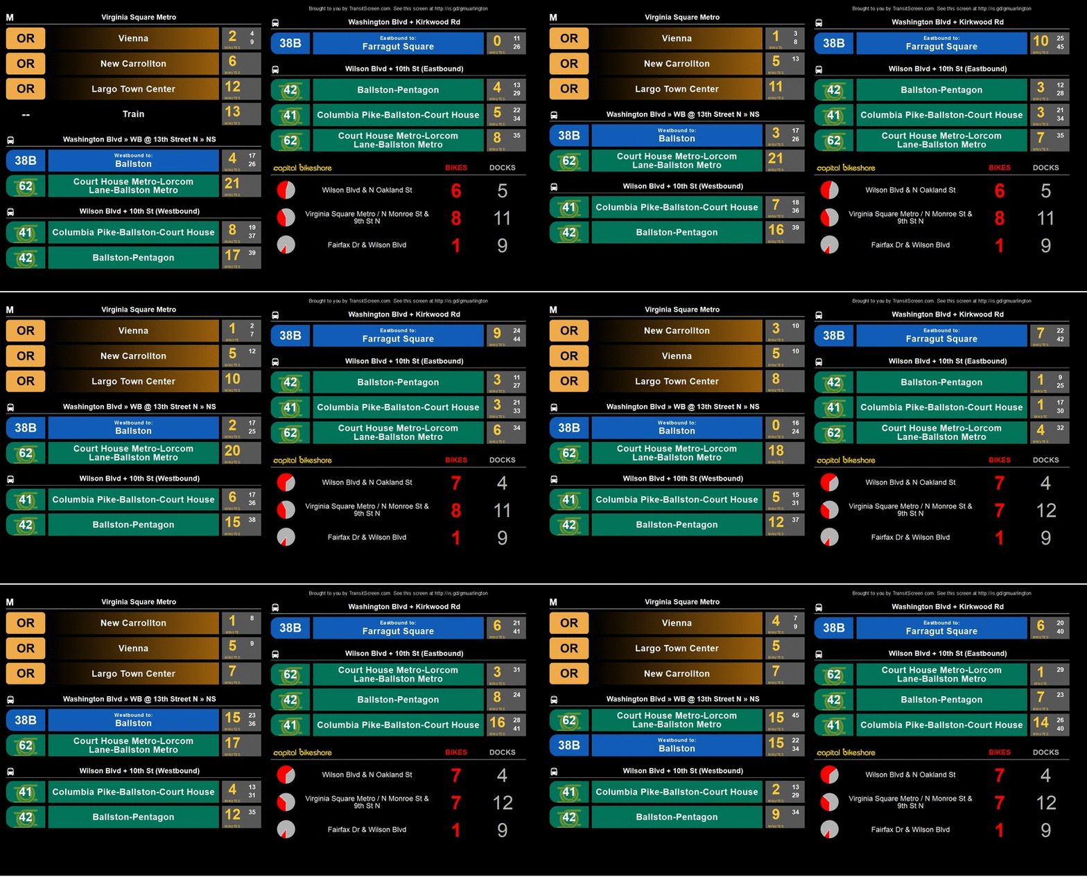
The service is now available in 30 cities in North America, but when TransitScreen was launched out of Arlington, Virginia in 2013, it was built only with D.C.-area travelers in mind. Take a look at the old design, below: District locals would figure out which schedule strata correspond to the Metro and which correspond to the bus, but a tourist or a business traveler might struggle. When TransitScreen expanded to lobbies, hotels, and campuses in other cities, the visuals remained essentially unchanged, assuming that users had at least some level of local transportation literacy.

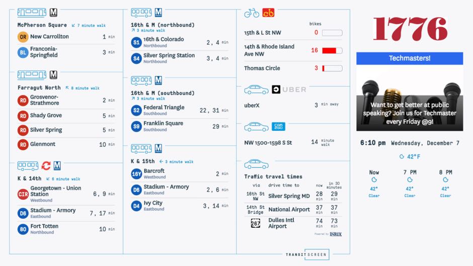
Matt Caywood, TransitScreen’s co-founder and a neuroscientist by training, says that this was one of the first considerations as his company revamped the displays with the help of the design firm Isometric. Now, the logos of local transportation agencies or services are shown alongside schematic symbols of the mode they represent. “As we’ve grown we’re looking more how people from out of town orient themselves,” he says. “They might not even know that a corporate logo refers to bike share rather a bus system.” In testing the new designs, pairing site-specific icons with generalized symbols helped users catch on faster.
From our partners:
Embrace “on-demand” modes
The original TransitScreen also put the emphasis on “transit”: All you saw were buses, trains, and bike share schedules. Car-based travelers were supposed to be lured out of their vehicles—not catered to. “We’re not trying to be a general mobile app for everything, wherever you are,” Caywood said. “We focus on providing a really high-quality experience, and a really understandable portrait of the transit options at your site.”
That’s now changed. Transit is still displayed first, but nearly one-third of display shows ride-share, car-share, and traffic time information. People have become more “multimodal” in a very short span of time, says Caywood. “So we’re not just directing them to a particular mode, but highlighting all the modes they’re used to seeing.”
Make timing everything
Costs being equal, the best transit choice is the fastest one. But that’s not so straightforward where you’ve got to factor in walking time, the possibility of scheduling changes, and whether you’re ready to hit the road. The new designs pays special attention to those details. First, notice the cardinal arrows pointing you in the direction of your X-minute walk. And notice how,
It’s not visible in the graphic featured here, but TransitScreen also tweaked the way the screens visualize changes in schedules and traffic. Every year, across 30 cities, its displays process billions of real-time updates from about 300 sources of data (think trains, buses, ferries, bike share, car share, ride-hailing, and traffic scans). Previously, arrival times and distances refreshed themselves simply and automatically, without calling any attention to the fact that they were changing. Inspired by old train-station flip-boards like the one Philadelphia recently scrapped, those sorts of updates are now subtly animated—new numbers shake into place. Caywood says this element draws on research into “calm technology,” the idea that, as more and more screens light up our lives, “they need to a better job of serving people, rather than just grabbing our attention.”
Awaiting a world of seamless mobility
City dwellers should expect to catch more of these slick screens at hotels, restaurants, bars, offices, stadiums, and campuses in the coming year. In 2014, just a handful of screens buzzed in 14 cities in the U.S. and Canada. About 100 of them existed by the end of 2015. Today, there about 1,200 across 30 towns, including a gigantic display at Boston’s Fenway Park. TransitScreen also recently partnered with the Bay Area’s Metropolitan Transportation Commission to build 180 screens hawking transit information from more than 20 local operators. Existing and new displays will get the aesthetic upgrades.
In many ways, these screens, and their design choices, anticipate the magical moment in which urban travelers can use a single, digital platform to compare all their travel options, map out trips, and pay for both public and privately operated services. There are still significant roadblocks before U.S. cities arrive at such a seamless world of mobility options, but these technologies are already appearing globally. (Helsinki, in particular, is figuring this out pretty fast.) TransitScreen is not an app; it’s purely an information display. But it offers an answer to a question that all of these platforms will be asking: How do you keep people from getting bogged down in zillions of options? “We need a better visual language,” says Caywood. This is a promising start.
This feature originally appeared from Citylab.


