No one can argue with statistics because they are hard facts. — are they really?
By this time, a lot of us have done a great job realising that not everything we see on the internet is true. Some of the information we receive is deliberately manipulated in order to influence our behavior or our perceptions
With this, we become highly skeptical. We look for reputable sources. We turn to the hard facts.
For instance, figures and statistics, right? No.
Statistics is a tool used to navigate in this world filled with uncertainty and risk. The figures it produces are nothing but approximations of the truth which may or may not be helpful in making decisions and gaining some understanding of the truth.
From our partners:
Throughout its existence, it has helped make valuable discoveries and innovations. However, just like any useful tool, statistics can also be used to take advantage of people and completely fool them.
Some manipulations in the realm of statistics can be as simple as a straightforward manipulation of data being presented or withholding them completely.
Yet some of the most sinister ways that statistics can fool us are elusive and can completely stay off our radars.
Here are 13 of the many subtle ways that statistics can fool us.
1. Sample size
In order for an analysis to be reliable, a sufficient sample size is crucial. There’s a formal theory statisticians and experts study to determine this.
Yet countless studies choose sample size arbitrarily. In this case, especially for a small sample, it is hard to be certain about the validity of an analysis.
Dr. Dillon Corvino from the Institut für Experimentelle Onkologie in Germany manages a Twitter account, @sayssamplesize, which tweets the sample size of studies. A quick scroll would tell you that some published studies have shockingly low sample sizes (as low as one!).
2. Sampling biases
Even if the sample size is correct, there may be sampling biases which may distort the results.
For instance, in a study assessing the viability of online learning, conducting an online survey is ridiculous since it will not capture the information of those without access. The consequences of biases magnify further when dealing with national affairs and high-risk situations.
3. Survey methods
Even with a lack of sampling bias and a proper sample size, the survey methods can also distort the results.
One way this can happen is through the use of loaded questions.
In an election poll, asking “Have you stopped supporting Candidate X?”assumes that a person has been supportive of the candidate. By the way the question has been phrased, a respondent is forced to answer only “Yes” or “No,” providing no explanations. This can easily be used to sway opinions, especially when they are extremely publicised.
Another common mistake is poor design. For example, in a product quality survey, collecting information from participants who have never used the product is not helpful at all, even if the results are favorable. For convenience, however, a lot of studies resort to faulty surveys.
4. Overgeneralization
The last misconception in studies involving samples is that they can be generalised to a larger group when usually, they can’t.
It won’t take serious mathematics knowledge to know that studying only a few hundred people and expecting the results to be applicable to an entire country simply won’t make the cut. But as mentioned earlier, sample sizes can get ridiculously low.
5. Correlations
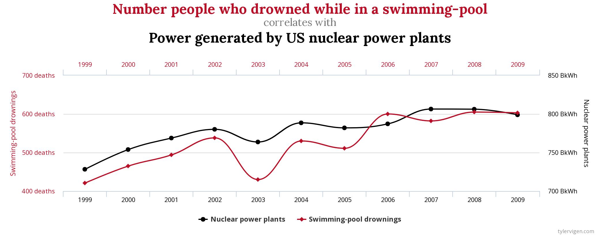
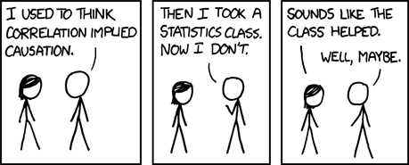
Correlation doesn’t imply causation. Tyler Vigen’s Spurious Correlations compiles some unusual correlations:
You can find some more on his website. The point is, not because two variables, X and Y, are highly correlated means that one causes the other. There are multiple possibilities:
- X causes Y
- Y causes X
- A third, confounding variable, Z is correlated with X and Y
- X and Y are not related at all —the observed correlation only happened by chance.
6. Margin of error
The “average” is a typically reported figure in the media. The main problem with how averages are reported is how they are portrayed as exact figures when in fact, there is a margin of error where the computed value can deviate from the true average.
There is also a small probability known as the level of significance that the average is way off this margin.
Other statistical outputs also have associated margins of error and levels of significance. While discussing them in-depth will be out of the coverage of this piece, the driving point here is that we shouldn’t look at the statistics we see online as if they were computed with pinpoint accuracy.
7. Percentages
Percentages are yet another abused figure in news and media. When the set used to compute them is small, these percentages can seem really convincing.
If a brand reports that 70% of the people use their products, any of the following can be true:
- 7 out of 10 people in their study use their products
- 700 out of 1000 people in their study use their products
- 700,000 out of 1,000,000 people in their study use their products
Yet the lack of information on how many people were used in the survey is often overlooked and unreported.
8. Visualisations
Visualisation may be one of the most helpful tools to communicate statistics. However, it is arguably also the best tool to distort people’s perceptions.

Among the most common manipulations is scaling. By changing the scale of graphs, the perceived effect of a particular attribute can be magnified or minimised.
9. Cherry picking
Cherry picking particular results to make them more appealing and persuasive is another way to mislead.
A study may have been replicated 100 times and there is only one time that success has been recorded. Yet publications would most likely showcase only the successful instance.
This is also a prevalent practice in media, where click-worthy results are published when there are a lot of others which refute the claim.
10. False metrics
Even if they are reliable and properly computed, statistics can still mislead if used improperly.
Five-star reviews, for instance, are not truly indicative of quality or performance. Businesses can deliberately manipulate metrics in order to improve their image. This can also be true for satisfaction ratings of politicians.
In the on-going pandemic, using a decreasing number of confirmed cases is not indicative of improvement. As President Trump noted himself, if the U.S. did very little testing, then their confirmed cases wouldn’t shoot up as high.
It should be noted that if the number of confirmed cases is low, that doesn’t mean that a lot of people are not infected, either. The metric only measures the number of tested cases.
11. Baselines
By conveniently choosing a baseline, the perception of growth can be inflated or deflated.
As an illustration, if Country A has the following economic output in the last ten years:
- 2010: USD 300 billion
- 2019: USD 345 billion
- 2020: USD 350 billion
The growth between 2019 and 2020 is 1.4%. Meanwhile, the growth between 2010 and 2020 is 16.67%. Using the latter as a baseline will reveal that the growth is a bit lacking in the previous year. Reporting the former, however, would make growth appear really impressive.
12. False permanence
Another false assumption about statistics is permanence.
This is especially true for relationships. While for one period of time, two variables may be highly related with one another. For the other, these variables may not be associated at all.
Another case where this is not true is growth. Not because a country’s economy is observed to be growing for one period means that it will continue to grow for life.
This means that one should be cautious about the time of publication of articles and journals, since their applicability may be limited to only that period.
13. McNamara fallacy
The McNamara fallacy is deciding based solely on statistical metrics, forgoing other relevant factors.
Going back to the COVID-19 pandemic, basing our success on a few metrics is not indicative of true success. What we really should consider is how the people are being affected along with their feedback. We simply cannot reduce humans and complex social structures as mere numbers —context matters in statistics.
Conclusion
We have mentioned quite a lot already but there are still so many ways that statistics can be used to deceive and mislead.
The lack of statistical literacy and its grossly simplified portrayal makes statistics such a convenient tool to manipulate — intentionally and unintentionally.
To make things worse, statisticians and other field experts are not always the best communicators of the nuances of statistical analysis.
For the refined communicators that are involved in media, on the other hand, these nuances are not exactly the priority.
Ultimately, the way to avoid deception is actively learning some fundamental statistics concepts and being aware of just how much error and risk is associated with the techniques being employed in the field.
Seeing the truth with statistics begins by recognising that it is in fact, not the truth itself.


