By focusing on emissions from goods consumed in a city, Berkeley researchers paint a more accurate picture.

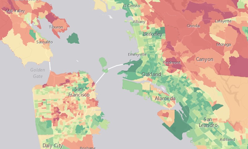
The nations of the world committed to slashing carbon emissions at the COP21 summit in Paris last month, and now cities and communities must figure out how to actually do that. In order to pull it off, local leaders will need to pinpoint the geographical sources of greenhouse gases and figure out what activities produce them. A new mapping tool from the University of California, Berkeley’s Cool Climate Network does this for the Bay Area in a uniquely granular way.

Typically, carbon footprint maps tally up the emissions coming out of a particular geographical area. For instance, my colleague Laura Bliss wrote about an atlas that visualizes energy use by building type and other Census variables in Los Angeles. That’s great for informing construction policies to make the built environment more carbon-efficient, but it doesn’t tally the life-cycle emissions of goods and services. Under the Berkeley map’s consumption-based accounting, households are responsible for the carbon emitted through the production and shipping of the goods they purchase, regardless of where in the world that takes place.
From our partners:
“If a business in China produces a computer that is purchased by a California household, then all emissions related to the production of that computer are allocated to the California household, not the Chinese company,” the authors, Christopher Jones and Daniel Kammen, write in the study explaining their methodology.
This approach leads to a higher carbon count for the Bay Area than a territorial approach—35 percent higher, in fact. The study points out that consumption measuring lends itself to calculating cities’ footprints, because dense urban populations rely on manufacturing and agriculture processes that emit carbon elsewhere.
By tallying up the emissions that happen on behalf of urban residents but are largely invisible to them, the study challenges customers to think through the ecological costs of purchasing food and products from across the world.

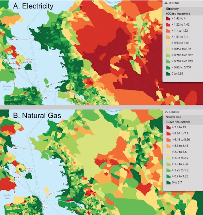
This has direct policy implications, because the way we measure emissions will determine the way we reduce them. City planners can now play around with this tool to figure out exactly which neighborhoods in which cities would benefit from policies targeting emissions from car ownership and driving as opposed to, say, air conditioning or gas heating. Tracts with above-average emissions from food consumption would be prime targets for urban farming initiatives. The authors also suggest expanding population density in the downtown cores shown to be low in carbon consumption while limiting new housing in high carbon consumption areas, which tend to be further from the cores. The map even distinguishes low carbon areas from high carbon ones within the same suburbs, showing just how much of an impact transit-oriented development can have.
“Cities exemplify the ecological benefits of density—having a lot of people living close to work, entertainment, and each other cuts down on overall greenhouse gas emissions. But cities still rely on products from less sustainable hinterlands.”
Visualizing the full range of carbon emissions from consumption keeps urban populations accountable for their actual environmental impact, even when it’s also felt in someone else’s backyard.
This feature originally appeared in CityLab.


