Maps are great instruments for navigation. However, they have little to say when it comes to describing how people are distributed in land.
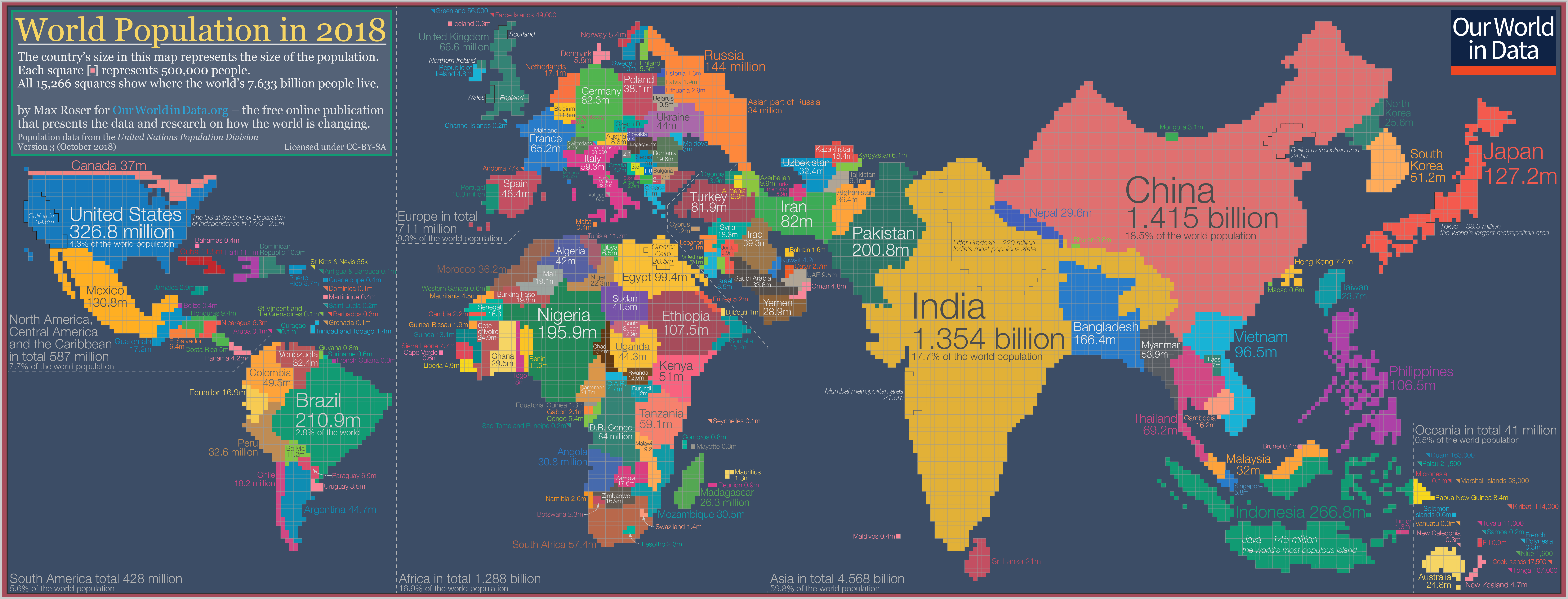
What if the size of the countries depended on their population sizes? Theoretically, this will be how the world will look like:

To download the full-resolution image, you may do so here.
This is what is known as a cartogram. This particular one was made by Our World in Data.
In cartograms, the size of the population is used as scale instead of the land size. This way, one can clearly see how humanity is distributed across countries.
From our partners:
At first glance, this is clearly the world map that we’ve been used to. However, we can observe that some small countries will become humongous and some larger countries will diminish in size if we take into account the population size.
Uncovered insights
Through the cartogram, we can see some obvious observations like China and India being the most populous countries in the world.
If we look closer, however, we can see relatively smaller countries like Japan and the Philippines depicted as extremely large.
A small country like Bangladesh will be just about the same size as the giant country of Russia if we only talk about population.
Basing from the map, a few number of countries can seemingly engulf the rest when it comes to sheer size. Our World In Data’s figures report that 13 countries in the world, together are home to 4.75 billion people, which is roughly 62% of the world’s population.
- China (1.415 billion)
- India (1.354 billion)
- United States (326.8m)
- Indonesia (266.8m)
- Brazil (210.9m)
- Pakistan (200.8m)
- Nigeria (195.9m)
- Bangladesh (166.4m)
- Russia (144m)
- Mexico (130.8m)
- Japan (127.2m)
- Ethiopia (107.5m)
- Philippines (106.5m)
Here is an interactive chart to explore the population growth from different countries:
A change in perspective
If our traditional maps barely have anything to say about the distribution of people in the world, we can expect that it will perform even worse in characterizing the living conditions in countries.
This is where visualizations like cartograms step in. Whenever we read about country statistics, we have to realize that an improvement in one country may be more or less impactful than the other.
For instance, Our World in Data cites life expectancy statistics: an improved life expectancy in Denmark equates to the improvement of the health of 5.8 million. However, an improved life expectancy in India will imply an improved health status of around 1.35 billion people.
Going back to our example of Russia and Nigeria, in spite of their extreme difference in land area, improvements in healthcare in these countries will amount to about the same magnitude of improvement.
The power of visualization
When we think of data analysis, people dealing with figures in order to arrive at estimates and decisions might come to mind.
However, an important instrument in revealing insights from the data is visualization. The human eye is a powerful analytical tool which can reveal things that a large set of numbers and statistical outputs cannot.
This is a sobering reminder for us now that we are receiving massive amounts of data in this digital age. The usefulness of data heavily relies on our ability to extract information and insights from it.
At times, the enormity of data can become burdensome. This rings even truer if we do not know how to handle it.
With this, we must continue to explore ways for data to speak to us. The ever-exploring mind is a crucial ingredient in paving the way towards inclusive policies and equitable reforms that we desire in this age.


