There are a lot of considerations when you want to visualize data. It starts with what you want to say, that is what your objectives are, what the chart or graphics conveys. These are only some of the things you need to think about. But one of the objectives is to create both meaningful and beautiful charts. Here are some of the resources you should bookmark.
01. Visual Vocabulary
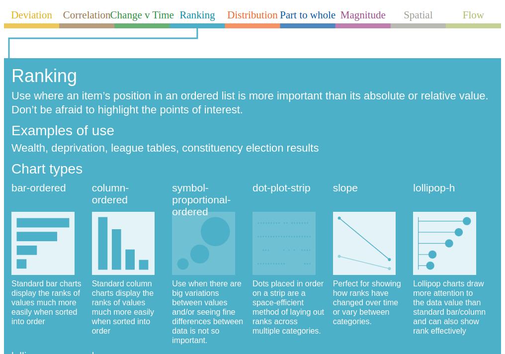
In this reference you will be able to choose an appropriate way to visualize your data by selecting from a category. An example use or use case and chart type will be shown.
https://ft-interactive.github.io/visual-vocabulary/
02. Data Viz Project.com
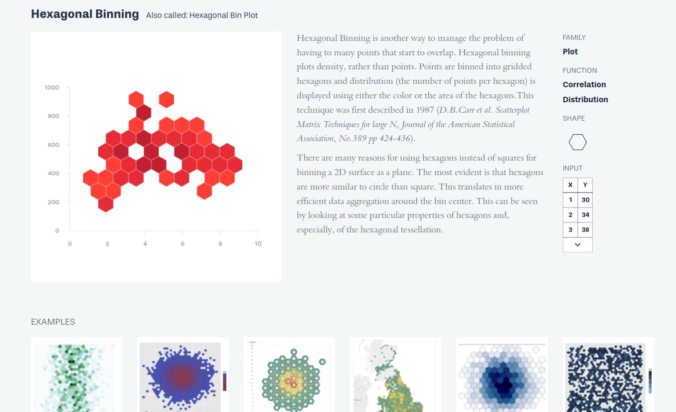
This time a list of chart types is laid out in the home page. If you select a specific chart type, you’d be brought to a page with a detailed description on what this chart is used for, along with examples at the bottom. The neat thing about this, is that at the right side, you’d see the list of Function this chart type is for, and at the bottom are examples.
From our partners:
03. Dataviz Inspiration
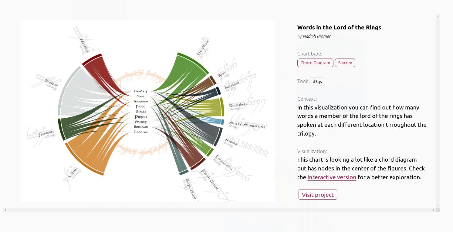
From the main page, a list of proejcts with charts are shown. Then these charts come together with actual data that can be filtered by function. From these examples you can take inspiration on what you want to try and convey with your chart or visualisation.
Another cool thing about this is that you can select the Programming language or tool that was used to generate these charts. From R, Python, tableau, d3.js, react, excel and others. These also have links to the actual project including the source code used.
https://www.dataviz-inspiration.com
04. Xenographics
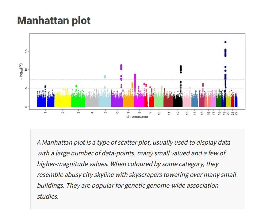
Similar to the previous references, this time you could search for specific chart types using the search bar. Each chart or diagram gives some insights and sometimes weird remarks on some of these charts. Just take a look at “Scatter Pies” and see the comment they made on it. As what they say “Weird but (sometimes) useful charts”
05. Visalization Cheat Sheets
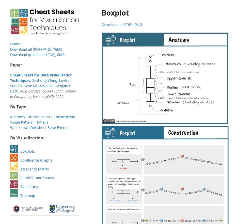
A literal cheat sheet for visualisation. The charts can be filtered by Type and Visualisazation. This one offers detailed description on how to use specific charts. It also explains what these chart conveys, given specific patterns.
https://visualizationcheatsheets.github.io
06. Chart.js
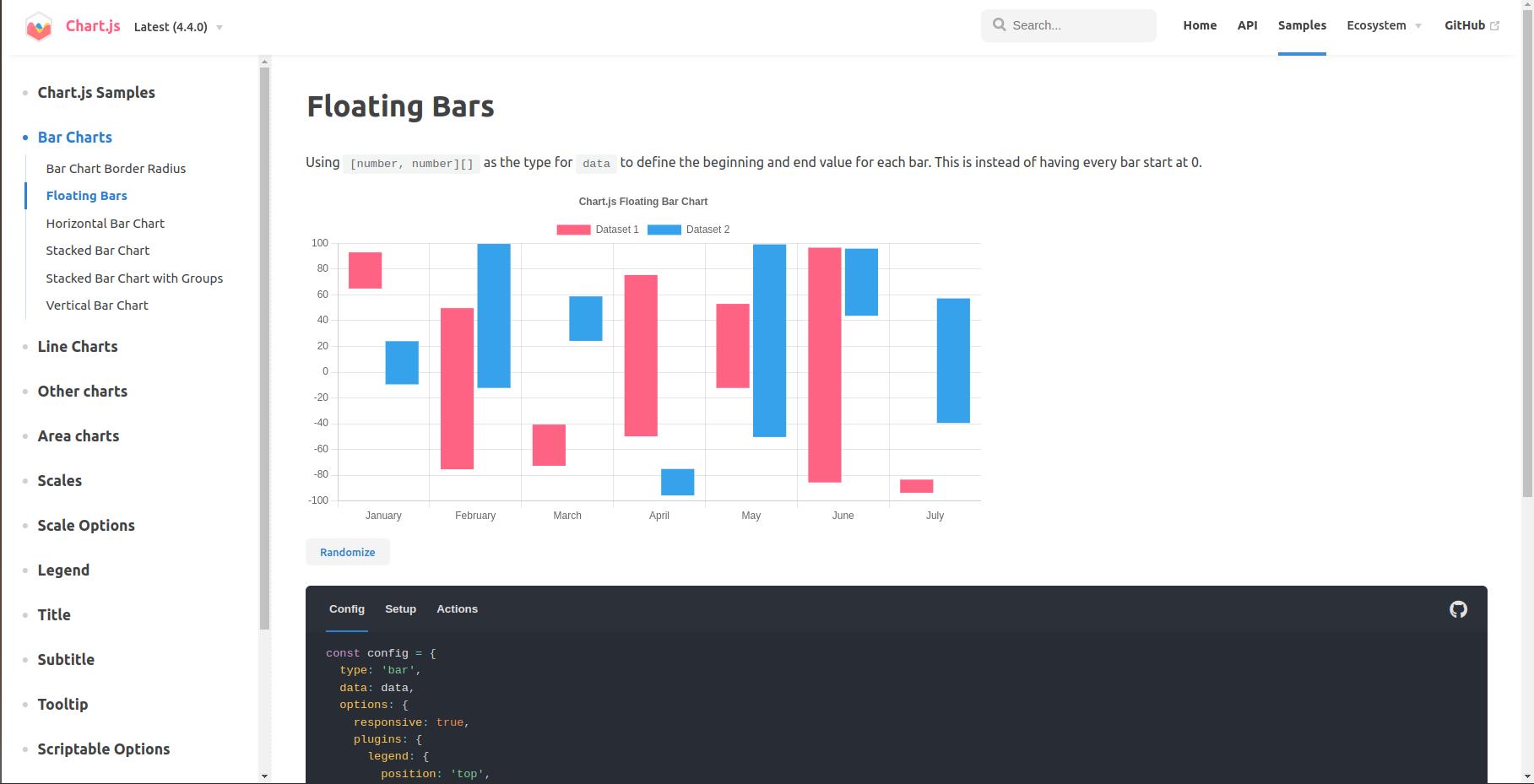
For the programmers, software engineer or those that just want their data to be visualised in a website. This is not really a cheat sheet or reference to decide which chart or visualisation to use, but a software library. It offers a wide array of available charts and step-by-step guide when building your own charts. It does require knowledge in programming.
Thank you ZedOptima for sponsoring this article


